St Cuthberts Mill Paper
Call or email:
+44 (0)1749 672015
sales@stcuthbertsmill.com
St Cuthberts Mill Paper
Watercolour
Printmaking
Digital Fine Art

![]()
Why the Colour of your Watercolour Paper Changes Everything
Watercolour is a uniquely transparent medium. Unlike gouache or oil, the paper beneath the paint isn’t just a support; it becomes part of the artwork. The shade of your paper subtly interacts with pigments, influencing the mood, vibrancy, and depth of your painting. Choosing the right shade isn’t just a technical decision; it’s an artistic one. The coloured tone of the sheet can ultimately change the composition of the finished painting.
Why watercolour paper shades matter
Every watercolourist knows that watercolour is delicate, fluid, and luminous. Because the paint is transparent, the colour of the paper shines through, affecting how colours appear on the surface. A painting on a creamy, natural white will feel warmer and softer, while the same painting on a brighter white paper will feel crisp, clean, and more vibrant.
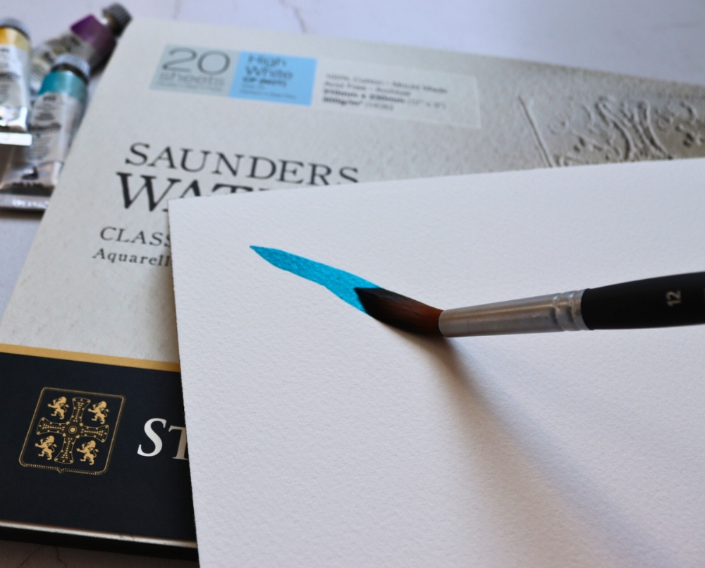
At St Cuthbert's Mill, we offer a range of watercolour papers, including off-whites, brighter (fade-resistant) whites, and exciting tinted watercolour papers in blue, eggshell, cream, and oatmeal.
Choosing the right shade of watercolour paper
Selecting a paper shade isn’t just about aesthetics; it’s about the feeling you want your painting to convey. Consider:
- Do I want the painting to feel warm and inviting, or bright and energetic?
- Will the paper shade complement or compete with the colours I’m using?
- How will the overall atmosphere of the piece change with a different paper tone?
Experimenting with swatches of different shades of paper can give you a clear idea of how your palette interacts with the paper, helping you make informed choices before committing to a final piece.
Thin layers of transparent watercolour are built up to form the painting, but under the paint sits your paper, being the support for the composition, holding the layers of paint together. The shade of this paper shows through the thin washes, subtly mixing with the paint’s pigments, and changing how the paint is viewed.
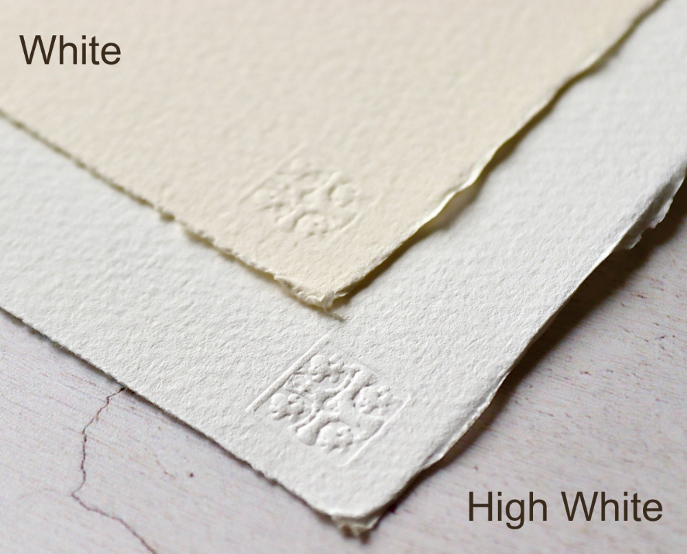
This is evident with the two shades of Saunders Waterford®, which are quite different whites, offering the artist the choice of a warm or cool atmosphere for the finished work of art.
Saunders Waterford® WHITE is a creamy white shade and the original shade of Saunders Waterford. It has creamy tones that gives a warmth to any composition using it. Saunders Waterford® HIGH WHITE is a bright white sheet. Paint worked on the sheet will have more clarity and vibrancy. The HIGH WHITE shade is often considered for more contemporary looking paintings, or where a greater range of tone is required from light to dark.
Why are 100% cotton papers often an off white antique colour?
This shade comes from a time when cotton came from recycled rags (this is no longer possible due to contamination with manmade fibres). It was an off-white shade with warm antique tones. Modern manufacturing uses cotton linters and lightfast pigments to create the creamy white shade.
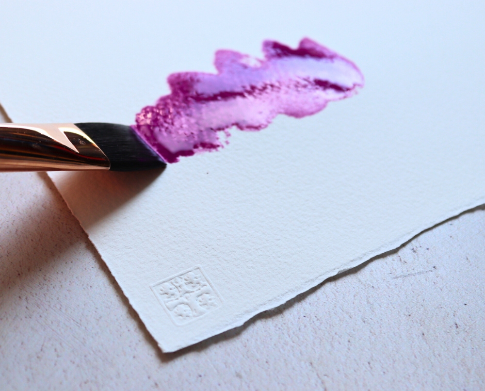
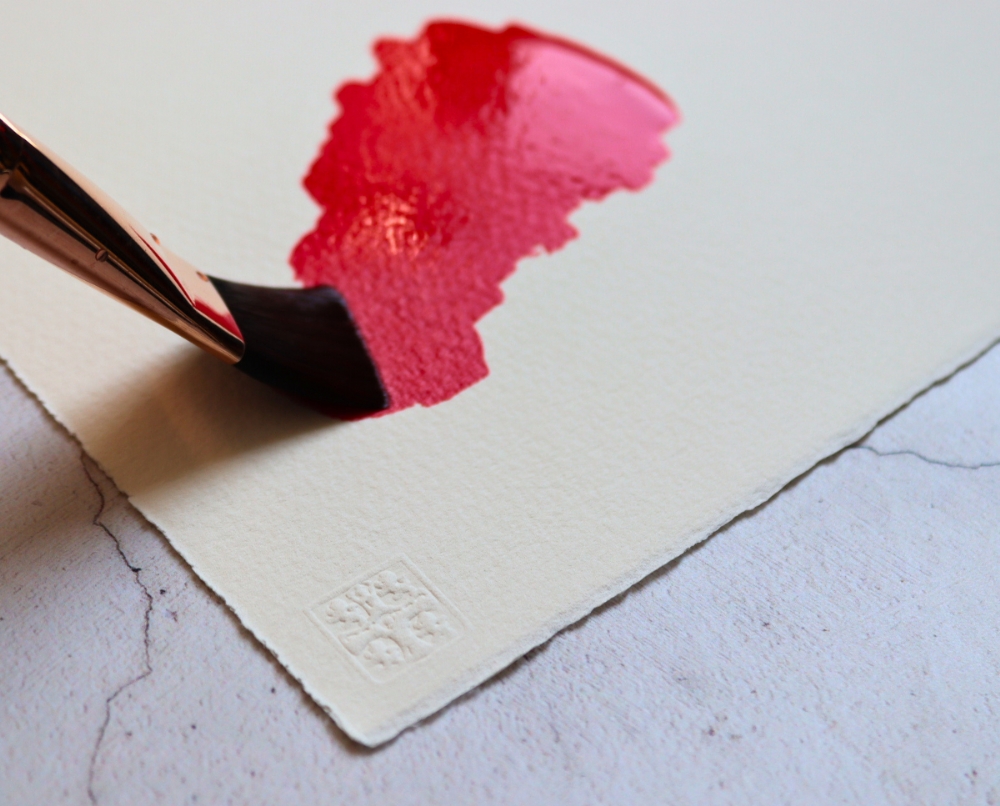
How to get white using pure watercolour techniques?
With pure watercolour techniques (i.e. not using white gouache or acrylic), the whitest tone of the sheet is the whiteness of the paper. This needs consideration for the artist when choosing a sheet where brighter highlights are required. For example, a cool mountain scene would benefit from the whiteness of Saunders Waterford® HIGH WHITE, Bockingford® WHITE, or Millford WHITE papers for snowcapped mountains, whilst a warm beach or desert composition would value the warmer tones of the Saunders Waterford® WHITE shade.
Unusual, tinted watercolour paper
In the Bockingford® series of papers are some exciting, unique shades of tinted papers with a BLUE, GREY, OATMEAL and CREAM paper. These sheets have a lightly tinted shade that directly affects the atmosphere of the finished watercolour painting, changing the feeling of the composition. These tints are designed to reduce the temptation to overwork the painting.
OBA free watercolour papers
At St Cuthberts Mill, we only produce fade-resistant shades of paper, so artists can rest assured the paper’s colour is archival and will not fade quickly over time. All the watercolour papers are made without bombarding them with OBAs (Optical Brightening Agents) that fade, darkening and discolouring the sheet. There are other watercolour papers available that have the ‘envelope’ bright blue/white sheen of OBA use, which some view as harsh and clinical, and should be used with caution if seeking archival qualities. These papers are suitable for quick, short-term practice projects, but should be avoided for longer-term work, as the OBAs can fade or yellow.
Watercolour paper is a partner in the creative process
Watercolour paper isn’t just a canvas; it’s a partner in your creative process. By thoughtfully choosing the shade of your paper, you can enhance the atmosphere, depth, and vibrancy of your paintings. The right paper can turn every wash and stroke into something luminous, expressive, and uniquely yours.
Also read: How Paper Shade Changes a Painting’s Mood
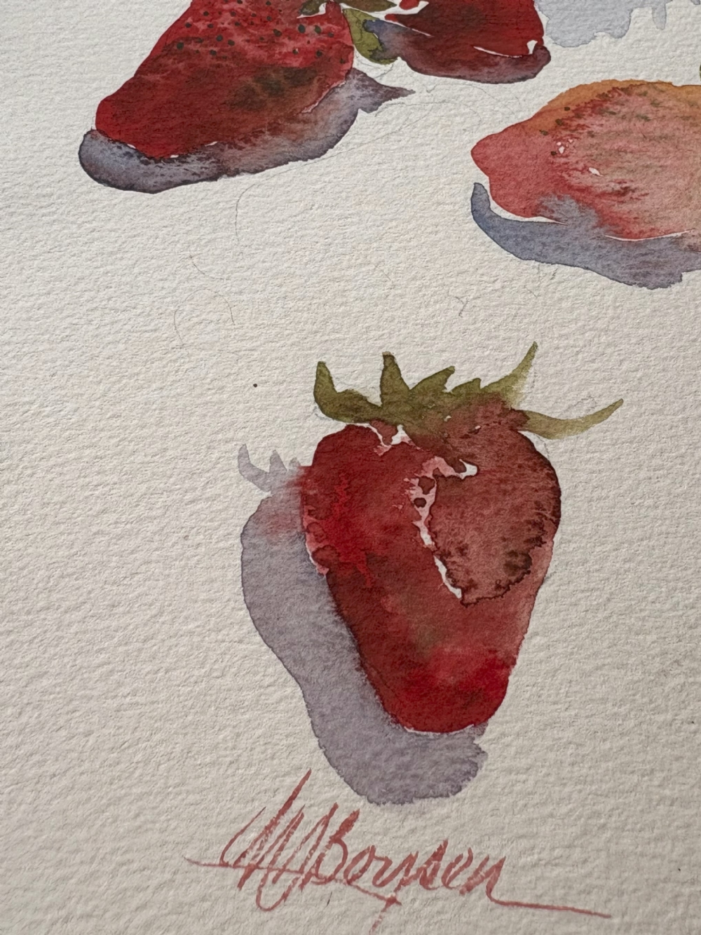
Paintings by JM Boysen