St Cuthberts Mill Paper
Call or email:
+44 (0)1749 672015
sales@stcuthbertsmill.com
St Cuthberts Mill Paper
Watercolour
Printmaking
Digital Fine Art

![]()
How the Paper's Shade Changes the Painting's Mood
The transparent washes of watercolour paint subtly change when applied to paper, with the base tone of the sheet influencing the mood and feeling of the painting. Choosing the right shade of paper for your painting is an artistic choice. Below will explain the different watercolour paper shades made by St Cuthbert Mill, and what atmosphere they can help achieve.
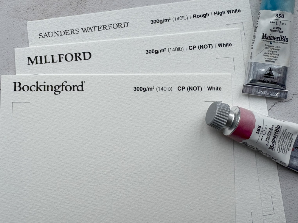
Understanding the options with Saunders Waterford®:
Warm vs Bright
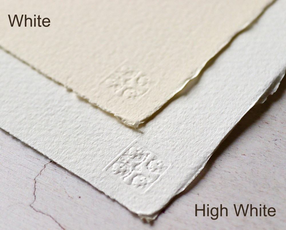
There are two shades in the Saunders Waterford® range:
- Natural White (WHITE): Despite its name, this shade has a soft, creamy tone that lends warmth and subtlety to your work. It’s perfect for atmospheric landscapes, gentle portraits, or any painting where a slightly muted, harmonious effect is desired.
- Bright White (HIGH WHITE): This shade is crisp and luminous, ideal for paintings that demand high contrast and vibrant colour. It makes washes pop and can give a fresh, modern feel to your work. Also perfect for paintings needing a high whiteness value for highlights, as with pure watercolour, the whiteness value of the sheet becomes the whitest highlight achievable.
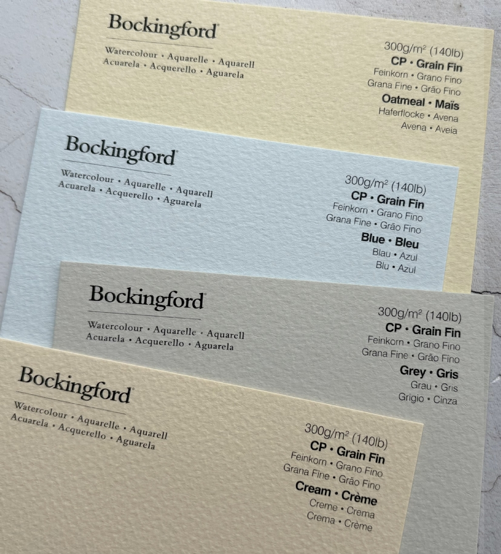
Tonal shade of Bockingford® and Millford watercolour papers
Both Bockingford® and Millford watercolour papers have a bright whiteness value to the paper's tone. Similar to the Saunders Waterford® High White, they will give a luminous feel for a fresher, more modern look.
Exciting shades of Bockingford® tinted watercolour papers
In addition to the standard ‘white’ shade of Bockingford®, there are also four exciting colours in the Bockingford range, including Blue, Oatmeal. Grey and Cream.
- Bockingford® Blue – Establishes a cool base tone, a calm foundation perfect for skies, water and winter scenes. The blue shade subtly shifts the perceived temperature of your paints. The blue base will evoke a feeling of calm, serenity and distance.
- Bockingford® Oatmeal – Has a warm, soft stone with the creamy-brown tint of oatmeal. It will give warmth to skin tones, landscapes and natural elements without the need to layer additional washes. It can make scenes feel more organic and inviting. Its tone can naturally give a slightly aged, rustic feel, making it ideal for vintage-type illustrations, sepia-like effects, or soft atmospheric backgrounds. The highlights using Oatmeal will be softer, more natural and perfect for delicate lighting.
- Bockingford® Grey – Provides a neutral mid-tone base that’s great for creating mood, depth, subtle contrast and drama. The soft, muted tone of grey is excellent for moody skies, fog, stormy landscapes, or twilight scenes. It naturally conveys atmosphere without relying solely on painted layers.
- Bockingford® Cream – A warm, soft-toned choice that can subtly influence the mood with a soft gentle atmosphere. The cream shade warms up your colours, making landscapes, portraits and florals feel more inviting and harmonious. The warm undertones complement skin tones, wood, earth and foliage, reducing the need for heavy washes just to achieve natural warmth. The subtle warmth will give paintings a slightly aged, classic look, ideal for nostalgic scenes. Highlights are less harsh, and shadows appear more integrated giving a smoother, cohesive feel.
Coloured watercolour paper encourages experimentation
Working on coloured paper challenges you to think differently about light, shadow, and layering. It can inspire creative choices and unexpected effects, making your work more dynamic and unique. Using a paper with a distinct tone as the foundation of your work can give your painting an atmospheric quality that’s harder to achieve with white paper. The whole paper will unify the palette and warm up or cool down the overall painting, immediately establishing the mood like an underpainting.
Watercolour paper as a creative partner
Watercolour paper is more than a surface; it’s an active partner in your artistic journey. The shade you select can shape the mood, richness, and intensity of your work. With the right paper, every wash and brushstroke gains brilliance, character, and a touch of individuality.
Also read: Why the Colour of Your Watercolour Paper Changes Everything
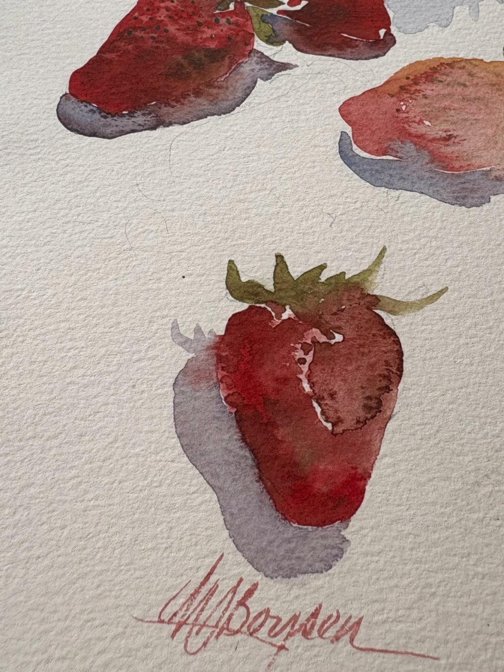
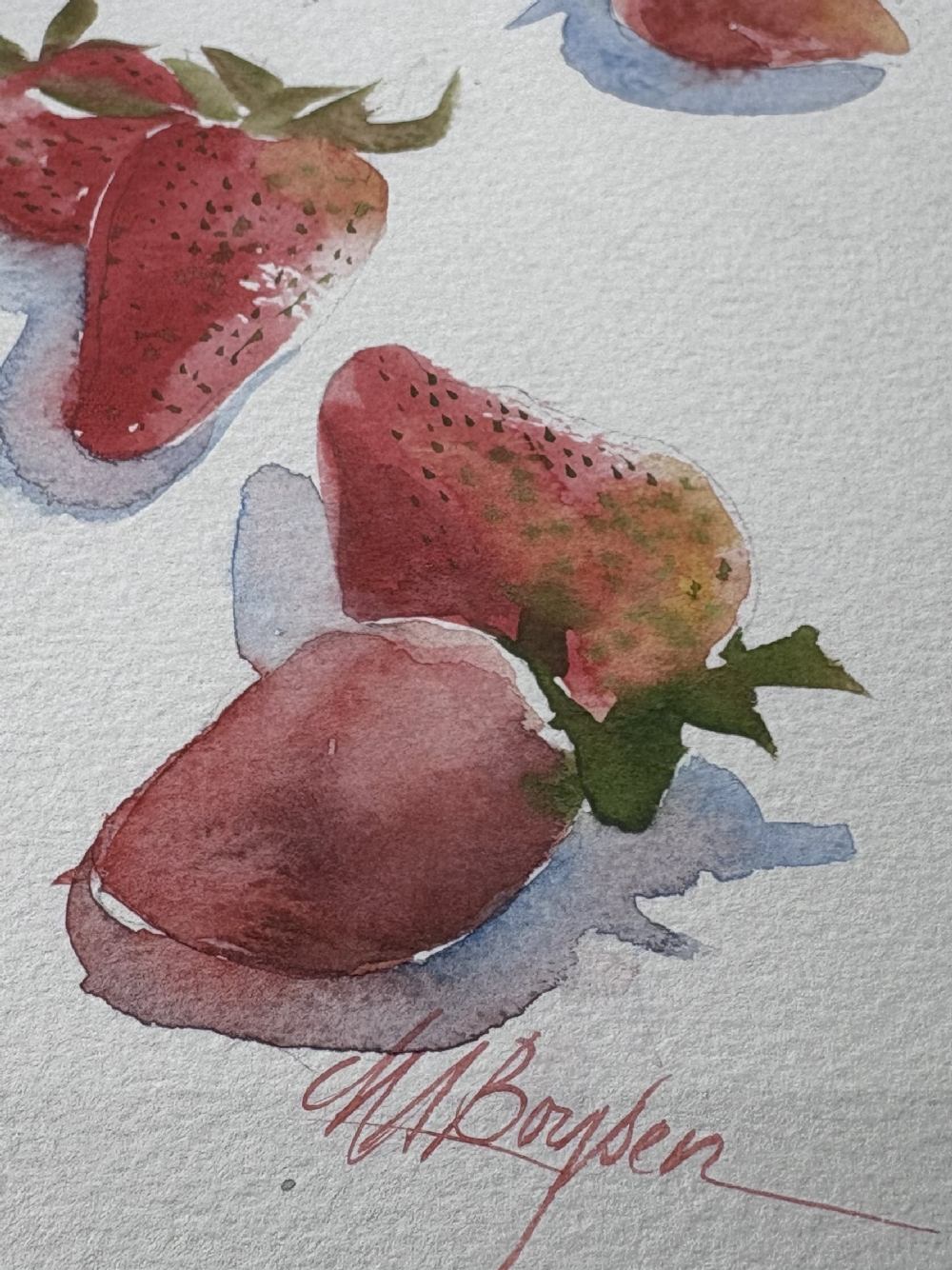
Paintings by JM Boysen